
Posted by Anais Guilem on 22/10/2019
New Issue: Graphical Template, Color Code
Following the issue about updating the introduction texts and diagrams of CRMbase, the diagrams need harmonization of color and forms. The color coding proposed is the one used initially since 2015 by the CRM game and implemented in 3M already. The color coding is available in the attached document "colorCRMTemplate".
Posted by Nicola Carboni on 23/10/2019
We do use the attached one, which summed up as:
Brown: HumanMadeObject -> #E1BA9C
Green: Place -> #94CC7D
Red: Actor, Person, Group -> #FFBDCA
Orange: Type, Language, Material -> #FAB565
Yellow: InformationObject, VisualItem, LinguisticObject -> #FDDC34
Light Yellow: Identifier, Name -> #FEF3BA
Blue: Period, Event, Activity, Production, Creation, Acquisition, Birth, Death, Destruction, etc etc etc etc. -> #82C3EC
Light Blue: TimeSpan -> #86BCC8
Grey: Dimension -> #E6E4EC
Purple: digital object -> #CAB5EB
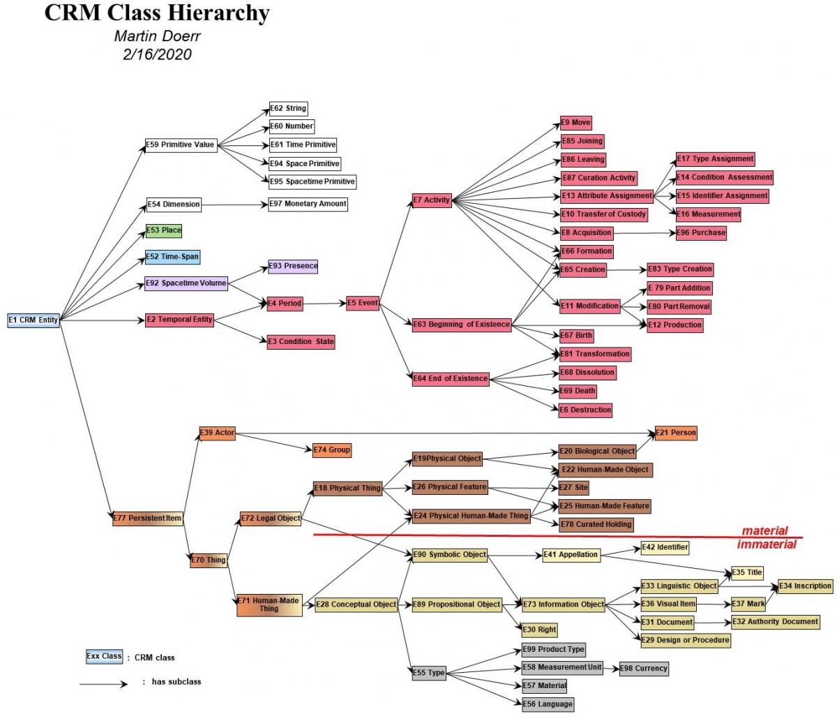
Posted by George on 24/1/2020
Here is the main entity diagram done with draw.io. The creation of this diagram is not automated. It takes time like other diagramming work. But it is a tool designed for diagramming and is an industry standard.
I think with the switch to version 7, we have a chance to bring aspects of the presentation of CIDOC CRM up to date. A key issue for the maintenance and growth of the standard into the future is making it accessible and understandable to its audience. This means looking for means to match to the styles and methods of the community that will take up the standard. Adopting tools that are recognized and endorsed by the community is a way of connecting with the community. Draw.io (or many other diagram software) allows implementing of standards in diagramming. Powerpoint is not a software primarily designed for diagrams.
Regardless of the software we adopt, consistency of message and communication style is both something which makes the message clearer and communicates a professional documentation approach. Arguably we should have a style guide for our diagrams which we adhere to rigorously and which we encourage to be taken up by those who would implement CRM. If we aim to create a common tool for people to share and understand information, it needs standardization on multiple levels, including its communicative devices.
The diagram here implements the colour scheme (already thought about a lot in LinkedArt and SARI communities inter alia), as well as a standard box size (150x50, arbitrary but consistent at least), and a consistent font and font sizes (Classes = Garamond 18, Bold, Properties, Helvetica 14, again arbitrary). While it might seem pedantic to focus on these things, I think they are key to the communication of the standard and would help significantly in its uptake.
I think the diagram above would work together better with the new texts we have derived to communicate the messages visually that we have described textually. One area where I think there could be additional improvement is the indication of cardinality. There are standardized ways of indicating cardinality with arrow heads which would bring us into line with standard ways of visually presenting this information and make the management of the diagram less finicky.
Best of all, the diagram can be made editable and reusable by SIG members online in a common space: https://drive.google.com/file/d/1afVfdWWU3UMADkS_OkAcifJBxWMlVRem/view?usp=sharing .
Posted by Steve on 24/1/2020
I like the diagram very much. It will be much easier to establish a consistent look and feel for things from this foundation.
3 Queries
1] In this new style how do we represent instances of classes? We used to use a box with two internal areas: a header for the class name and a body with the instance identifier
2] Is it necessary to include quantification on the properties if showing instances? I would prefer not but happy to fit in with the Meta.
3] What is the colour scheme for E59 Primitive Values like E62 String
OK Maybe 4 queries but the last one is more of a request; can we produce a “master” with all classes (including extensions) and properties (with quantification) pre-created
Onwards and upwards
Posted by George on 24/1/2020
>I like the diagram very much. It will be much easier to establish a consistent look and feel for things from this foundation.
Huzzah! to the queries:
>3 Queries
>1] In this new style how do we represent instances of classes? We used to use a box with two internal areas: a header for the class name and a body with the instance identifier
Open to debate in my opinion. I tend to follow that style, so I just put the instance information in the same box in italics and not bold below the class name. Usually the instance info for me though is a field identifier in a schema. What I also see very much done (it is CHIN's practice and Getty's) is to draw the instance out in its own separate box. This is analytically more correct for one particular instance although it gets messy when you have a complicated situation to show. Perhaps we could run an experiment and see which one sat better?
>2] Is it necessary to include quantification on the properties if showing instances? I would prefer not but happy to fit in with the Meta.
Probably when showing instances, we are representing a theoretical KB rather than the model itself, so they aren't necessary? Whether we use the current style or the standard line/arrow head iconography, it is quite a pain to represent the cardinality on all properties. In the context of this explanatory main graph it makes a lot of sense though.
>3] What is the colour scheme for E59 Primitive Values like E62 String
I prefer white.
>OK Maybe 4 queries but the last one is more of a request; can we produce a “master” with all classes (including extensions) and properties (with quantification) pre-created
Yes, I would propose creating a shared folder where all this can live (which can also be referenced/made accessible on the CIDOC site either with or without login). I would say that the master template could also have a standard legend and then we would be good to go. Speaking of legend, it is a question I wonder about. Should a title and legend be included in the diagram itself (in which case we could add version information etc.) or would this only exist outside the diagram in the relevant formats where it was reproduced?
>Onwards and upwards
to Narnia!
Posted by Martin on 27/1/2020
Dear All,
Please allow me to be critical with the new diagram. I very much prefer IsA to be always top down. It should be intuitive to suggest inheritance of properties.
Further, this was the easy case. I would like to see diagram 3 and 4 in a good publication quality, and then make a broader experiment with users! Please go ahead
I have no objections against drawio for other purposes.
If the point is a particular line style for IsA, we can declare that independent from the tool.
I prefer to be independent from any tool, actually for the publishing quality.
If it is the built-in semantics, some interoperability with RDFS, that would be very important indeed.
With respect to the colors, I am not really happy with all of them. Temporal Entities and people should be "hot", active. Blue is the most inactive, psychologically.
I'll make a different proposal.
Anyway, please continue, but for the next release, I'd argue this is the last thing we can play with.
Please finish the texts! Check consistency of the new constructs, are all examples in place???
Posted by George on 24/1/2020
Dear Martin,
A few notes on that.
> Please allow me to be critical with the new diagram. I very much prefer IsA to be always top down. It should be intuitive to suggest inheritance of properties.
So you mean the section that does persistent items to the right? I suppose it can also go downwards, but the function of the arrows is to indicate the relation.
> Further, this was the easy case. I would like to see diagram 3 and 4 in a good publication quality, and then make a broader experiment with users! Please go ahead:-)
I will do this. I do not foresee a problem.
> I have no objections against drawio for other purposes.
> If the point is a particular line style for IsA, we can declare that independent from the tool.
> I prefer to be independent from any tool, actually for the publishing quality.
Yes I think the style should be indicated independent of the tool but it would be nice if we could as a group coalesce on some modern tools that allow collaborative work such as draw.io. PowerPoint requires a license, isn’t made for making diagrams and does not allow collaborative work. Ie it has a lot of drawbacks and is not very standard.
> If it is the built-in semantics, some interoperability with RDFS, that would be very important indeed.
I would happily toss all drawing tools for one with built in semantics! Maybe the Viennese group can be approached again?
> With respect to the colors, I am not really happy with all of them. Temporal Entities and people should be "hot", active. > Blue is the most inactive, psychologically.
These colors have been worked on for a couple of years and are quite widely circulated so it would be quite unfortunate to now go in a completely different direction. They were chosen with purpose. An aim was made to not over excite the soul, such as with a bunch of flashing red nodes.
> I'll make a different proposal.
> Anyway, please continue, but for the next release, I'd argue this is the last thing we can play with.
I would argue version 7 is the place to give a new look. In fact work on these aspects of the presentation has been going on for some years now.
> Please finish the texts! Check consistency of the new constructs, are all examples in place???
I’ll happily jump in on explanatory texts.
Posted by Martin on 24/1/2020
Hi George,
> On 1/24/2020 5:35 PM, George Bruseker wrote:
> Dear Martin,
>A few notes on that.
>> Please allow me to be critical with the new diagram. I very much prefer IsA to be always top down. It should be intuitive to suggest inheritance of properties.
> So you mean the section that does persistent items to the right? I suppose it can also go downwards, but the function of the arrows is to indicate the relation.
No, I mean putting E39, E18, E28 not below E77, but to the right. It should be below E77, to suggest that P12 also applies to E39 etc.
>>Further, this was the easy case. I would like to see diagram 3 and 4 in a good publication quality, and then make a broader experiment with users! Please go ahead:-)
> I will do this. I do not foresee a problem.
>> I have no objections against drawio for other purposes.
>>If the point is a particular line style for IsA, we can declare that independent from the tool.
>>I prefer to be independent from any tool, actually for the publishing quality.
> Yes I think the style should be indicated independent of the tool but it would be nice if we could as a group coalesce on some modern tools that allow collaborative work such as draw.io. PowerPoint requires a license, isn’t made for making diagrams and does not allow collaborative work. Ie it has a lot of drawbacks and is not very standard.
Well, endless discussion. We started CRM with Merise graphs. Was industry standard at that time. We abandoned because of layout limitations. Then we pushed adopting an ISO standard, STEP, but was no good for KR. Then UML was THE paradigm, but has incompatible attribute semantics. Over all the years, we have a stable style on our page. Double arrow for IsA is very expressive and was standard when we adopted it.
>> If it is the built-in semantics, some interoperability with RDFS, that would be very important indeed.
> I would happily toss all drawing tools for one with built in semantics! Maybe the Viennese group can be approached again?
I think we had some candidates once.
>> With respect to the colors, I am not really happy with all of them. Temporal Entities and people should be "hot", active. Blue is the most inactive, psychologically.
> These colors have been worked on for a couple of years and are quite widely circulated so it would be quite unfortunate to now go in a completely different direction. They were chosen with purpose. An aim was made to not over excite the soul, such as with a bunch of flashing red nodes.
Well, I am not talking about brightness, I am talking about color psychology. If you think you have set some standard, that's an argument. Of course you chose them with purpose, as I do. I would not assign deep blue to events. Aesthetically, I am not convinced of the combination of all of them. I'd use less distinctions.
Typically, non-IT people take IsA links for properties. That is important for a graphical language to be addressed.
I do not like big empty spaces, when it comes to integrating graphs in publications. The big canvases for class nodes take valuable space. The very variable length of class names make it a problem to have a fixed size class box. Properties are again second class citizens in this representation.
I like the gradation in the class boxes which makes them more "tangible", more 3D.
I do not think we can have exactly one style for exchanging graphs and for publication. We could harmonize fonts, IsA link style, etc. to make sure what are the essential elements of our graphical language.
>> I'll make a different proposal.
>> Anyway, please continue, but for the next release, I'd argue this is the last thing we can play with.
> I would argue version 7 is the place to give a new look. In fact work on these aspects of the presentation has been going on for some years now.
Yes, that is what I meant. I said we can still deal with that when the meaning and text of v7 is set.
>> Please finish the texts! Check consistency of the new constructs, are all examples in place???
> I’ll happily jump in on explanatory texts.
Good!
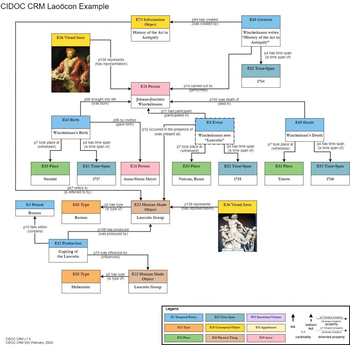
Attached a few color ideas. Don't kill me for brightness! Violet could also be used. Note, that the Winkelmann graph should also be consistent with the new style.
Posted by Thanasis on 24/1/2020
Dear all,
A few comments from me about the diagrams:
1) I recommend thick coloured outlines for the rectangles as opposed to filled in boxes. See attached. The problem with filling in is that the text does not always look good (especially for the visually impaired - like black on blue), gradients for higher classes do not really work and it consumes too much ink when printing!
2) I vote for instances to be attached to classes underneath as separate boxes.
3) I think the style guide is a good idea as well. Unless you have other connections, I can look into finding a designer from UAL to produce a draft for us with some LCD money although it will be rushed as the project ends in a week and it might not be possible. So maybe wait on this when new resources become available?
Posted by Thanasis on 24/1/2020
Is the current style developed in collaboration with a graphic designer?
Posted by Martin on 24/1/2020
Dear Thanasi, All,
Clearly, we need to have a style for the release that looks convincing in a publication, can represent the complexity of the things we need to show on one graph, and can be easily understood by non-IT experts.
Therefore, I propose a full set of test styles for the 5 graphs we foresee so far in the release, and a public vote, possibly tests with students. A graphic designer may be useful, if she understands the intended message.
I welcome everything that fulfils the above. I think we need another style for teaching and CSCW, as similar as possible to the publication style.
Posted by Steve on 25/1/2020
Thanasis, all
Not a big fan of this Border look or the instance being in another box beneath; I think it needs to be inside the confines of the class box.
I agree with Martin's idea of getting several versions of the same set of diagrams and seeing which has the most "pop" . Maybe the Borders will grow on me.
Gosh progress is so fast at the moment: I am dizzy
Posted by George on 26/1/2020
Dear all,
Regarding the new graphs thread and the graph competition. I submit mine here. Each is available in many different format outputs. I put the pngs below in the mail, but it also outputs as PDF/HTML/XML etc. etc. I included in all the diagrams a title, legend and metadata about production date, author and crm version referenced. I think we would also want to think about putting a copyright status on?
Here you can explore them in an HTML presentation. (HTML Version) Note how in the main entities diagram I have made the classes also links to a versioned explanation of the concept. This could be a handy feature for the web version of the diagrams.
Also we are able to edit them collaboratively as a group online without exchanging files. You can find the source here: https://drive.google.com/file/d/1afVfdWWU3UMADkS_OkAcifJBxWMlVRem/view?usp=sharing.
I also created a standard legend and start on building a toolkit for using as a default for making new presentations. I believe there is a way to create our own template and be able to start from the same standard. Speaking of standards, the box size chosen has been sufficient to capture all class names. It would get trickier with instances. I have not formulated a strong opinion on instance representation yet myself, but will keep cogitating.
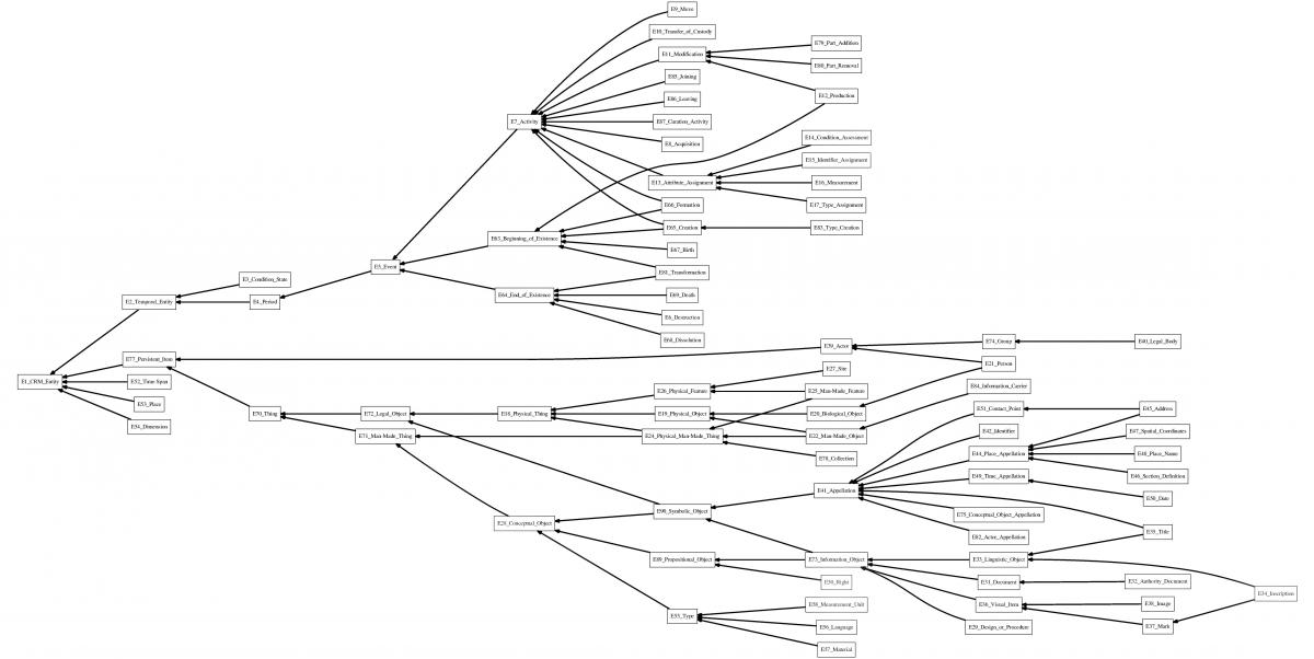
CIDOC CRM Main Entities

Comment: usually in such a presentation I would put in E7 Activity and make the point also about agency etc. I wonder if it would make more sense to separate out the names and types stuff to its own small graph to make the point about names and types which is separate to the rest of the content here which is about using temporal entities to connect items through time.
CIDOC CRM Spatial Information Representation

In passing, it is interesting to note that while we can track the different locations of physical objects over time through move, we have no similar class for actors. This use case has come up with CHIN that wishes to track the various places in which a company has set up outlets/offices over time. Probably a CRM soc thing, but definitely an important unmodelled phenomenon.
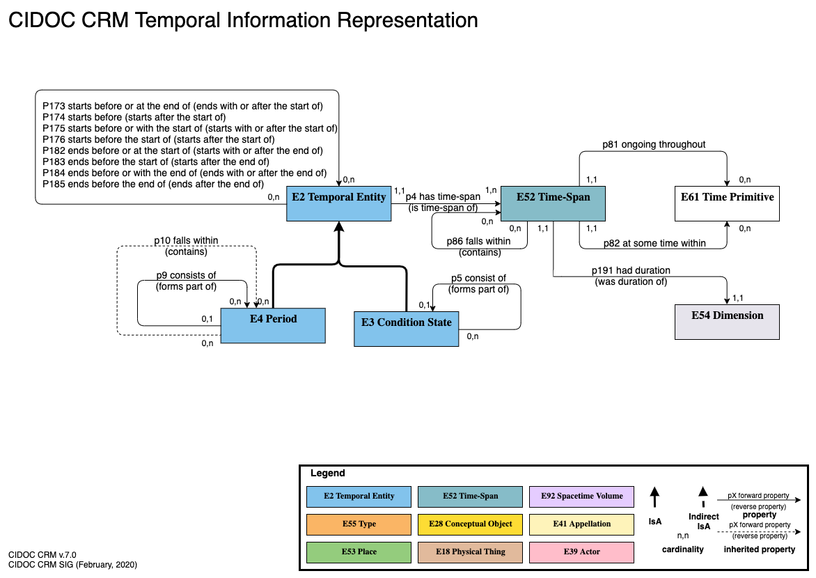
CIDOC CRM Temporal Information Representation

Comment: reflecting on this diagram, I had the following aporia. I understand why the part/whole relation between a process (E4 and down) and a state (E3 and down) would be different in principle. That being said, how then would one interrelate the two? A state cannot be part of a process (if I read this right) or vice versa. But you might want to say that such and such a state was persistent throughout some sort of process. The UK was member of EU (state) in the deliberations over Lisbon (process). Could we presently say that? Would we want? Just some random reflections, not having thought about this problem before.
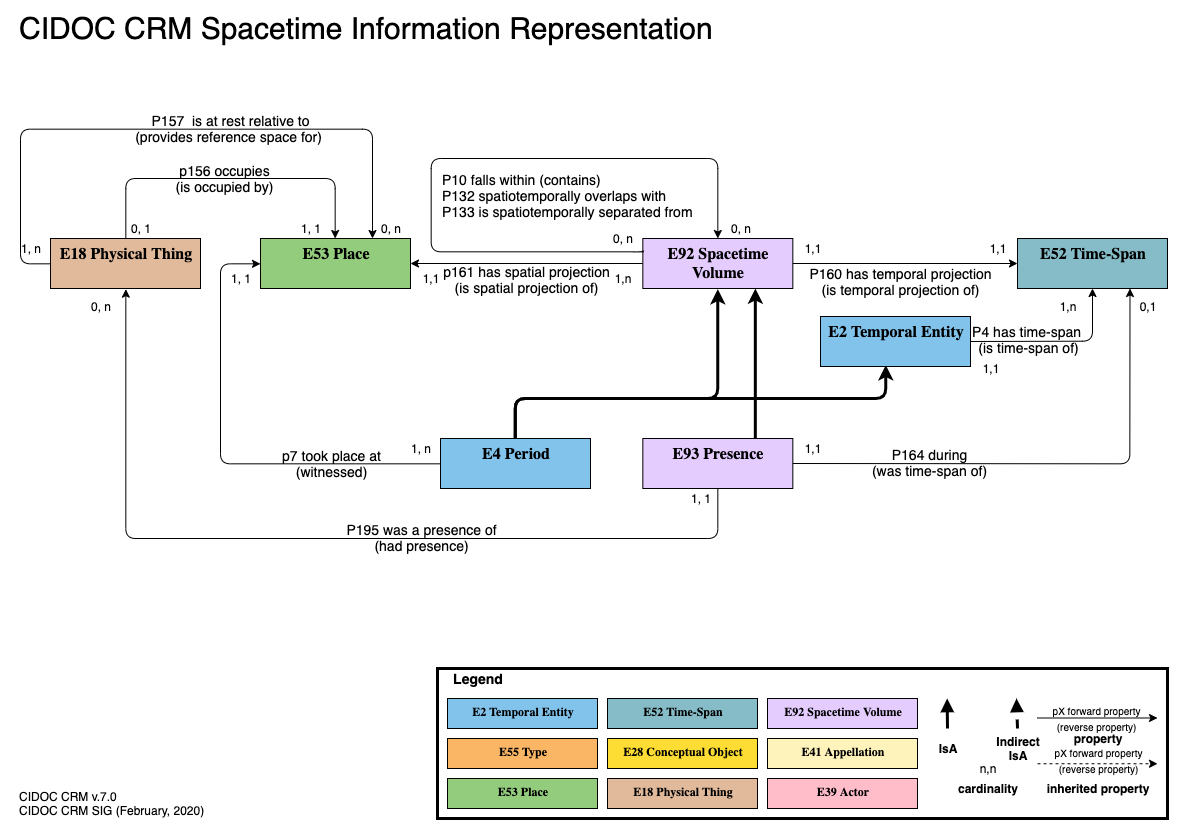
CIDOC CRM Spacetime Volume Representation

This was the most difficult to represent. Generally I think it is highly confusing and unhelpful to cross lines in diagrams. This part of the ontology seems to force crossed lines. I did my best and reduced the line crossings to one. Perhaps with distance I could think of a better solution, but at present I think this is the best solution I can come up with.
General comments:
For the first three diagrams, I have had an initial go at creating an explanatory text. I wasn't sure of the length of text we were going for or what we considered the appropriate level for the audience. It is a beginning anyhow. I wasn't really sure what to write for spacetime volume, I think I would leave it to someone who has used them in modelling to give a clearer explanation of their application. I am not sure in the texts I have proposed if there is perhaps too much repetition from other sections. One place where I thought I definitely did not think it would be wise to repeat information was regarding the temporal topological relations, where it seems like making a reference to the introduction of those in the text would be wise.
Here are my texts: https://docs.google.com/document/d/1-ShgVqRd0Yb18SbCWheWONFB5chuTUKo7skeAxoFMX0/edit?usp=sharing
Anyhow, that is the state of things from my end for now.
Posted by George on 26/1/2020
Hi Thanasis,
Some comments:
> 1) I recommend thick coloured outlines for the rectangles as opposed to filled in boxes. See attached. The problem with filling in is that the text does not always look good (especially for the visually impaired - like black on blue), gradients for higher classes do not really work and it consumes too much ink when printing!
It is true that the readability is somewhat medium dependent. As I mentioned in my other mail, the colour choices in my graph have been worked on over the last few years by multiple actors trying to optimize against these problems. The main colours have more or less stayed the same but work on choosing different hues etc. has proceeded ahead to try to optimize the colours for projector presentation readability. I use them in my teaching etc. and it works fine. They are not accessible in the proper sense since people with colour vision issues are disadvantaged. That being said, I think that it is a reasonable effort so far to pick the most differentiated colours so as to try to create the most differentiation.
That being said, thinking of hockey, there are often two or three different jerseys for a team, each of which keeps the same logic and colour collection but is used for away/home and cool. It is possible that we could make a printing variant or something that would also use the same colour and other strategies but colour borders instead of the main element. This would be a useful variant I imagine for different audience and media.
> 2) I vote for instances to be attached to classes underneath as separate boxes.
At some point I guess I will play with the Laoocon example and see what my opinion is. Normally I don't have to represent instances.
> 3) I think the style guide is a good idea as well. Unless you have other connections, I can look into finding a designer from UAL to produce a draft for us with some LCD money although it will be rushed as the project ends in a week and it might not be possible. So maybe wait on this when new resources become available?
Someone with professional skills in design I think would be great to have on board. I made an effort thus far at making a legend etc. Could be a sounding board.
Posted by George on 26/1/2020
Hi Martin,
Comments on comments.
>>>Please allow me to be critical with the new diagram. I very much prefer IsA to be always top down. It should be intuitive to suggest inheritance of properties.
>>So you mean the section that does persistent items to the right? I suppose it can also go downwards, but the function of the arrows is to indicate the relation.
>No, I mean putting E39, E18, E28 not below E77, but to the right. It should be below E77, to suggest that P12 also applies to E39 etc.
This is also what I meant. I don't think it was particularly confusing, but you will see that in the new version of the diagram I shifted it to also have a vertical flow. I was looking to make everything fit in one frame which I have succeed doing this way as well, so all is well that ends well.
>>>Further, this was the easy case. I would like to see diagram 3 and 4 in a good publication quality, and then make a broader experiment with users! Please go ahead:-)
>>I will do this. I do not foresee a problem.
>>>I have no objections against drawio for other purposes.
>>>If the point is a particular line style for IsA, we can declare that independent from the tool.
>>>I prefer to be independent from any tool, actually for the publishing quality.
>>Yes I think the style should be indicated independent of the tool but it would be nice if we could as a group coalesce on some modern tools that allow collaborative work such as draw.io. PowerPoint requires a license, isn’t made for making diagrams and does not allow collaborative work. Ie it has a lot of drawbacks and is not very standard.
> Well, endless discussion. We started CRM with Merise graphs. Was industry standard at that time. We abandoned because of layout limitations. Then we pushed adopting an ISO standard, STEP, but was no good for KR. Then UML was THE paradigm, but has incompatible attribute semantics. Over all the years, we have a stable style on our page. Double arrow for IsA is very expressive and was standard when we adopted it.
If the double arrow is important, it could be switched in the diagrams I have made. I think just have two different types of lines and a legend is key. Draw.io I think is the best generalist tool around that is free and widely adopted by the community in 2020. I have seen other tools out there that are particularly for ontology modelling but of course then they would like to make the equivalence between ontology and owl. Since we do not want to make that move, adopting a generalist tool that has better features for publication and sharing seems to have a lot of advantages behind it.
>>>If it is the built-in semantics, some interoperability with RDFS, that would be very important indeed.
>>I would happily toss all drawing tools for one with built in semantics! Maybe the Viennese group can be approached again?
>>I think we had some candidates once.
>>>With respect to the colors, I am not really happy with all of them. Temporal Entities and people should be "hot", active. Blue is the most inactive, psychologically.
>>These colors have been worked on for a couple of years and are quite widely circulated so it would be quite unfortunate to now go in a completely different direction. They were chosen with purpose. An aim was made to not over excite the soul, such as with a bunch of flashing red nodes.
>Well, I am not talking about brightness, I am talking about color psychology. If you think you have set some standard, that's an argument. Of course you chose them with purpose, as I do. I would not assign deep blue to events. Aesthetically, I am not convinced of the combination of all of them. I'd use less distinctions.
The whole colourization movement was initiated by Anais. The colours were chosen deliberately to be subdued and non-aggressive. Over time and negotiation with different communities the colours have been adjusted in hue in order to accommodate readability. The temporal entities for example are light and not dark blue. The physical entities are a beige brown instead of a dark brown. This has been tested for use in projected presentations.
>Typically, non-IT people take IsA links for properties. That is important for a graphical language to be addressed.
>I do not like big empty spaces, when it comes to integrating graphs in publications. The big canvases for class nodes take valuable space. The very variable length of class names make it a problem to have a fixed size class box. Properties are again second class citizens in this representation.
I do not see how the properties are second class citizens in this presentation. They are precisely the same ratio to the class font as in powerpoint diagrams. In the new version of the diagram I put the class boxes closer together so that there is less white space. The class boxes having one size allows all the names to fit regardless if they are short or long.
>I like the gradation in the class boxes which makes them more "tangible", more 3D.
It could be interesting to play with shadow effects etc., but I was for the moment trying to keep it simple and digestable.
>I do not think we can have exactly one style for exchanging graphs and for publication. We could harmonize fonts, IsA link style, etc. to make sure what are the essential elements of our graphical language.
Yes I think there should be a style sheet that is beyond a software, but also it would be good for SIG to use one software and approach. Draw.io has great advantage in that it produces its products in numerous formats, which should make rationalizing the work (an essential aspect) easier.
>>>I'll make a different proposal.
>>>Anyway, please continue, but for the next release, I'd argue this is the last thing we can play with.
>>I would argue version 7 is the place to give a new look. In fact work on these aspects of the presentation has been going on for some years now.
>Yes, that is what I meant. I said we can still deal with that when the meaning and text of v7 is set.
I have written up texts.
>>>Please finish the texts! Check consistency of the new constructs, are all examples in place???
>>I’ll happily jump in on explanatory texts.
>>Good!
>Attached a few color ideas. Don't kill me for brightness! Violet could also be used. Note, that the Winkelmann graph should also be consistent with the new style.
I thought we already agreed the colours in the last meeting officially, so I am confused as to why we would revisit the issue, especially when there is already strong community convergence around the colours already accepted.
Posted by Martin on 26/1/2020
Dear George,
Very good layout! Of course, crossing lines are bad. I tried to keep the Physical thing somehow below, that was the reason. I wasn't aware the colors were decided as final. I thought it was for testing, sorry.... Anyway, for the publication version, I prefer the class boxes to be as slim as possible, and I'd prefer property arrows to be thicker (this is why they appear to me second class citizens), and definitely a double line for IsA. I prefer labels to be clear and strong. Important to check, how the diagram appears within the document. Are the labels the same size or larger than the text font itself?
The Winkelmann example is very important for me.
Posted by Costis Petrakis on 27/1/2020
The colors of rdf viewer in 3M are the following:
|
Entity |
Element Color |
Type Color |
Icon |
|
Temporal Entities |
#5286b5 |
#cce1ea |
|
|
Actors |
#9b4c4c |
#e0d3d5 |
|
|
Physical Things |
#6b625e |
#cec6c0 |
|
|
Conceptual Things |
#aa9126 |
#efe8bb |
|
|
Places |
#6a753d |
#d5e0c6 |
|
|
Other Entities |
#cdd1d3 |
#656666 |
|
An example is attached here
Posted by George on 28/1/2020
Hi Martin,
Back to the diagram.
Very good layout!
Cheers
Of course, crossing lines are bad. I tried to keep the Physical thing somehow below, that was the reason. I wasn't aware the colors were decided as final. I thought it was for testing, sorry....:-[ Anyway, for the publication version, I prefer the class boxes to be as slim as possible, and I'd prefer property arrows to be thicker (this is why they appear to me second class citizens), and definitely a double line for IsA. I prefer labels to be clear and strong.
So I increased the line size for the properties and bolded the text for the properties.
Draw.io does not have a nice double line line. I made the IsA line very fat and gave it a different arrow end.
I left the class boxes the same size because I think making the lines larger restores the balance you wanted.
Important to check, how the diagram appears within the document. Are the labels the same size or larger than the text font itself?
I don't follow what you mean.
Click through the link to see the new look
https://www.draw.io/#G1afVfdWWU3UMADkS_OkAcifJBxWMlVRem
Here are the attachements main entities, temporal, spatial, spacetime
posted by Thanasis on 3/2/2020
SVG does not support double line as far as I know either. If it is
necessary it is faked with two lines and a triangle in the place of the
arrow. I like the double line, but I recognise the frustration of not
being able to implement it easily.
Posted by Martin on 18/2/2020
Dear All,
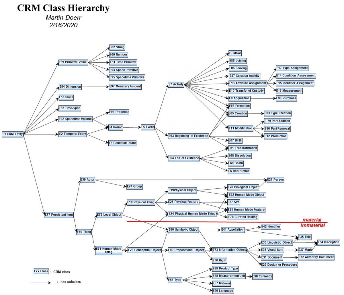
Attached the complete new Class Hierarchy in powerpoint and excel
Please use as reference.
I suggest to make color proposals on the complete hierarchy.
Posted by Martin on 19/2/2020
... and here the coloring book for the children.....;-)
May be the high-level classes should be in "rainbow style" with the colors below as George suggests....
Posted by George on 19/2020
Hi Martin, all,
Here's my version of the same using draw.io, consistent with the other diagrams. This version of the diagram follows the prototype produced by Martin in excel and powerpoint. I do not presently have access to any version of Microsoft Office, so I am working with free, open source software. Would it be possible to make a PDF of the excel/powerpoint versions? I think my software doesn’t read them properly.
I include a png and an html of this version. The HTML doc is more handy as you can jump right to the class definition by clicking on a class.
Posted by Martin on 19/2/2020
Hi George,
Here is the pdf, and odp format.
For showing the whole IsA hierarchy alone, I prefer the layout from left to right, because the branching gets more compact.
Posted by George on 19/02/2020
Hi Martin,
Thanks, now I can see them as they were meant to be. The ODP format also works for me.
Posted by Thanasis on 20/2/2020
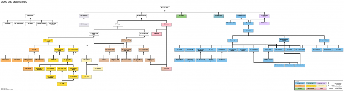
I like this one, only to note two things:
1) Martin's horizontal hierarchy results into a more square figure whereas George's vertical hieararchy becomes very oblong which may be a problem when printing or putting in slides as the font gets very small. Increasing the vertical spacing will result in lots of empty space. I appreciate it is not trivial to rearrange this.
2) Angled arrows make a tidy graph but reduce readability a little bit when we have classes with multiple parents, but I do not think this is a problem.
Posted by Martin on 20/2/2020
Dear All,
Here some recent science....:-D
https://www.ncbi.nlm.nih.gov/pmc/articles/PMC3743993/
https://www.panaacea.org/wp-content/uploads/2016/05/The-effect-of-colour-on-children%E2%80%99s-cognitive-performance.pdf
https://www.sciencedaily.com/releases/2009/02/090205142143.htm
Posted by George on 20/2/2020
Here is some classic philosophy of colour, nicely summarized!
https://plato.stanford.edu/entries/color/
Posted by Martin on 22/2/2020
Hi George,
Please let me vehemently contradict that an overall graph is meaningless. It is very important to have an understanding of the total of classes, when doing a mapping. It is exactly what we are continuously asked: How do I map this or this, use A? anwser no, use B! ..Oh, I didn't see that...
We have in the past developed thesauri with very large horizontal hierarchies, the largest being 7000 terms, printed out the size of a table. We could definitely show that it allows for important insight in the logic, consistency and quality of the system.
I do believe that it is an error to see class hierarchies in isolation, because the whole story is in the properties. The different seemingly independent branches of the class hierarchy interact via properties.
Of course interactive graphics are better, but that is not a question of the layout. We have always published the whole IsA hierarchy on the CRM Website. I can invest some time and make it further compact.
Posted by George on 22/2/2020
Hi Martin,
>
> Hi George,
>
> Please let me vehemently contradict that an overall graph is meaningless. It is very important to have an understanding of the total of classes, when doing a mapping. It is exactly what we are continuously asked: How do I map this or this, use A? anwser no, use B! ..Oh, I didn't see that...
We’re in absolute agreement! I just offered a different representation and what feels to me (could be different for others), a more approachable representation. I will repeat though that the whole CIDOC CRM class hierarchy is nonsensical to present on a single powerpoint slide projected on a screen or on an A4 page in a way that is usable by a normal human. Because it has so many classes (quite justifiably) it is too small to read and too much information at once. It would be like putting the first 200 words of English on an A4. Not super helpful.
>
> We have in the past developed thesauri with very large horizontal hierarchies, the largest being 7000 terms, printed out the size of a table. We could definitely show that it allows for important insight in the logic, consistency and quality of the system.
Sure, I just made the direction different from horizontal to vertical, trying new things. I suppose if it got to 7000 terms it also would not fit on a single powerpoint slide or an A4 page but require sliding horizontally right?
>
> I do believe that it is an error to see class hierarchies in isolation, because the whole story is in the properties. The different seemingly independent branches of the class hierarchy interact via properties.
I agree, but the exercise here is to represent the hierarchy. That is what both versions do, no (one vertically, the other horizontally)? The other diagrams which we have been discussing show the major relations.
>
> Of course interactive graphics are better, but that is not a question of the layout. We have always published the whole IsA hierarchy on the CRM Website. I can invest some time and make it further compact.
I guess the communal exercise here is to see if we couldn’t arrive at new representations that are even more modern and up to date so as to connect to ever broader audiences.
Posted by Thanasis on 22/2/2020
I also think that being able to see the whole hierarchy in one go is a useful thing for teaching. I use it all the time to indicate in a topological sense how the different areas correspond to different groups of classes. I think having the classes colour-coded in a diagram showing the whole hierarchy would be very helpful, i.e. yellow for perdurands, brown for perdurants etc.
See a monochrome example attached.
Posted by Martin 22/2/2020
On 2/22/2020 6:41 PM, george@takin.solutions wrote:
>
>>
>> We have in the past developed thesauri with very large horizontal hierarchies, the largest being 7000 terms, printed out the size of a table. We could definitely show that it allows for important insight in the logic, consistency and quality of the system.
>
> Sure, I just made the direction different from horizontal to vertical, trying new things. I suppose if it got to 7000 terms it also would not fit on a single powerpoint slide or an A4 page but require sliding horizontally right?
Of course not on screen, but on paper, 2m by 1m or so. Gathered around the table.
But the ppt I sent you I use to zoom in and out, and I can comprehend the whole easily in that way. Not useful for slide show.
Posted by George on 22/2/2020
>
>>
>> We have in the past developed thesauri with very large horizontal hierarchies, the largest being 7000 terms, printed out the size of a table. We could definitely show that it allows for important insight in the logic, consistency and quality of the system.
>
> Sure, I just made the direction different from horizontal to vertical, trying new things. I suppose if it got to 7000 terms it also would not fit on a single powerpoint slide or an A4 page but require sliding horizontally right?
Of course not on screen, but on paper, 2m by 1m or so. Gathered around the table.
But the ppt I sent you I use to zoom in and out, and I can comprehend the whole easily in that way. Not useful for slide show.
Alright so we all agree that it requires a wide format, large presentation medium. At that point either vertical or horizontal works and it’s just a question of stylistic preference and habit. I don’t really mind either way. I thought gong vertical would be an interesting presentation and more consistent with all the other graphs. For me it works very well; I see the whole and the part breakdown immediately. The horizontal way is okay too, just slightly inconsistent with the other representations.
In the 46th joint meeting of the CIDOC CRM SIG and ISO/TC46/SC4/WG9; 39th FRBR - CIDOC CRM Harmonization meeting; this issue was discussed together with issue 471 ; discussion points mentioned here apply to 471 as well.
There is no need to create one diagram for all purposes, nor use the same software to produce a diagram representing the same information. In that sense, given the purpose of the diagram, one should be able to choose among one or the other software (.pptx vs draw.io, for instance). Being used for didactic purposes, means that the diagrams are not subject to limitations of space (printed page). On the other hand, the graphics in the CIDOC CRM definition must be readable and cannot exceed in size the printed page. In any case, more proposals can be made regarding the tools for making diagrams, the sig should be oriented towards open source tools. There was a long discussion regarding features of the graphs; the discussion can be found here.
The crm-sig decided to revisit this issue after version 7.0 is released.
Athens, February 2020
Posted by George on 2/4/2020
Hi all,
Here are some versions of the graphs to follow up on the conversation around harmonising graphical documentation of CIDOC CRM.
With draw.io (now diagram.net) have composed the three graphs specified in the homework in the two colour schemas. Once we have the powerpoint versions as well, I guess we can also build the poll around this question?
Best,
George
P.S.: I was not sure what colour was proposed for spacetime volume in the alternate colour schema so I just left it as the colour that I proposed already.
Posted by Martin on 4/4/2020
Hi All,
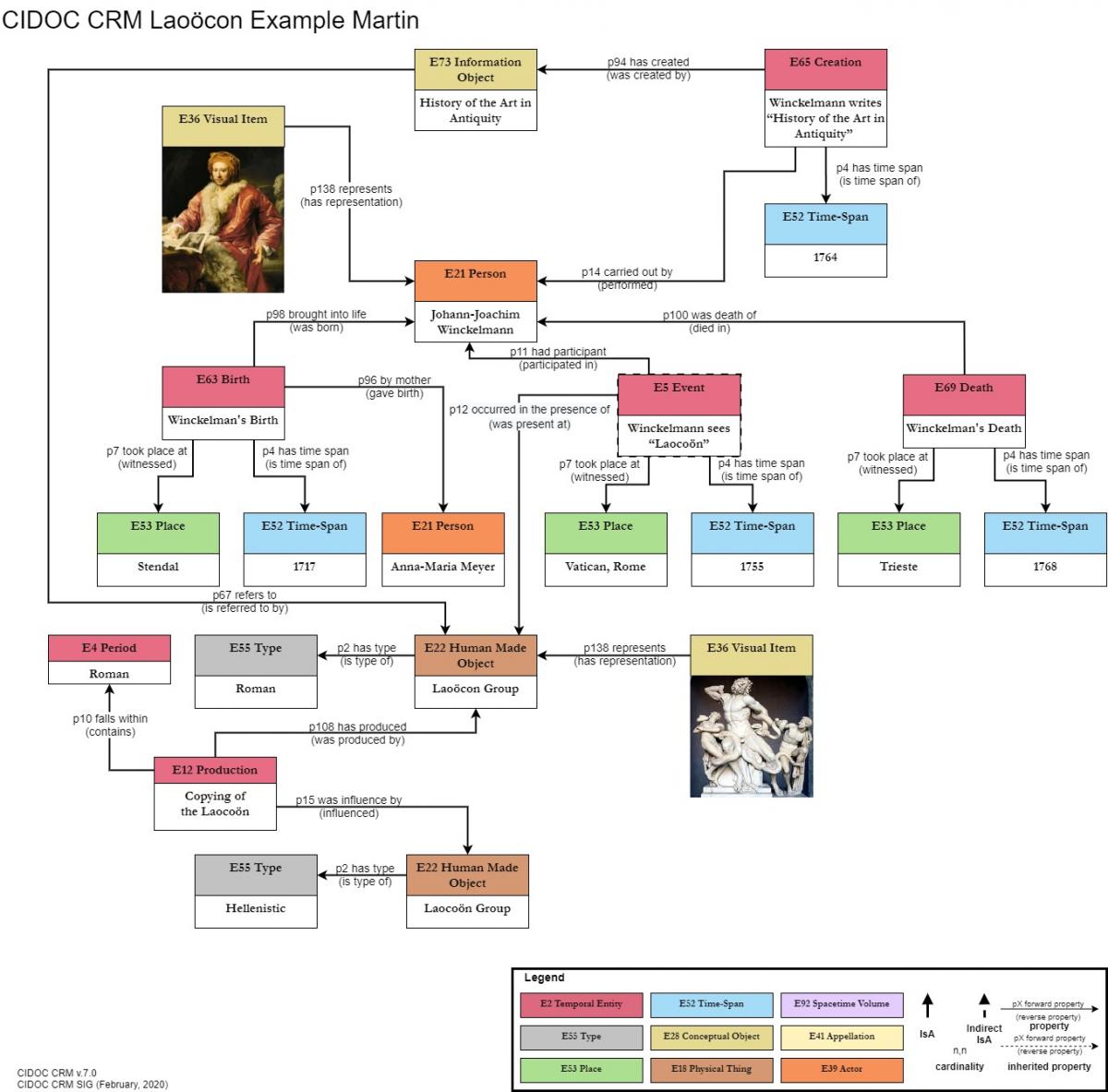
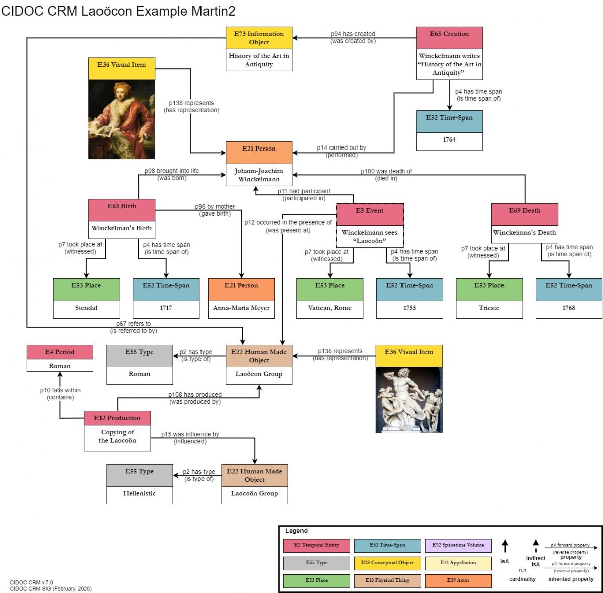
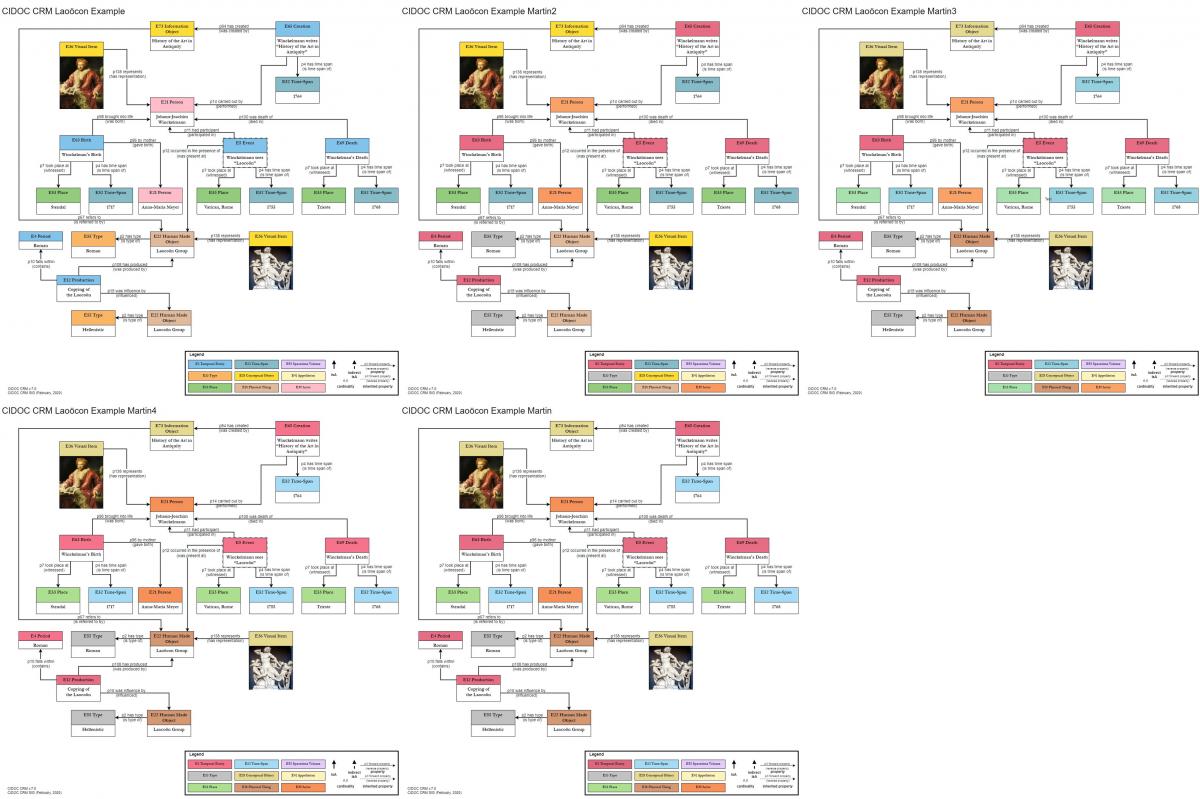
I have taken up George's nice graphs, and worked on the alternative colors. So far, I have used only the Laocoon example George sent in the below message.
I made 4 alternatives:
One with my native colors, slightly improved. (Example Martin)
One with my native colors, and E2 still lighter. (Example Martin4)
One with George's colors, only E39, E2, E55 changed to mine (Example Martin2). Here, I find the bright yellow of E28 annoying.
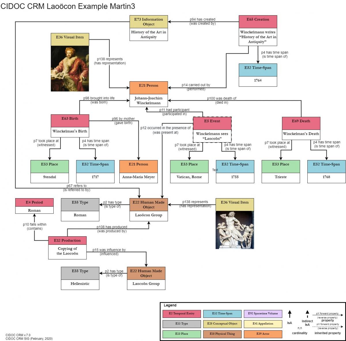
One with still more subdued colors, based on a paler version of George's E52,E53, again with my golden E28.
Before continuing, I'd like to have your opinions on my 4 alternatives, so I can create the rest of the set
I further suggest all property labels in bold, and only with the label of the arrow direction, not the inverse.
Posted by Thanasis on 6/4/2020
Dear all, Martin,
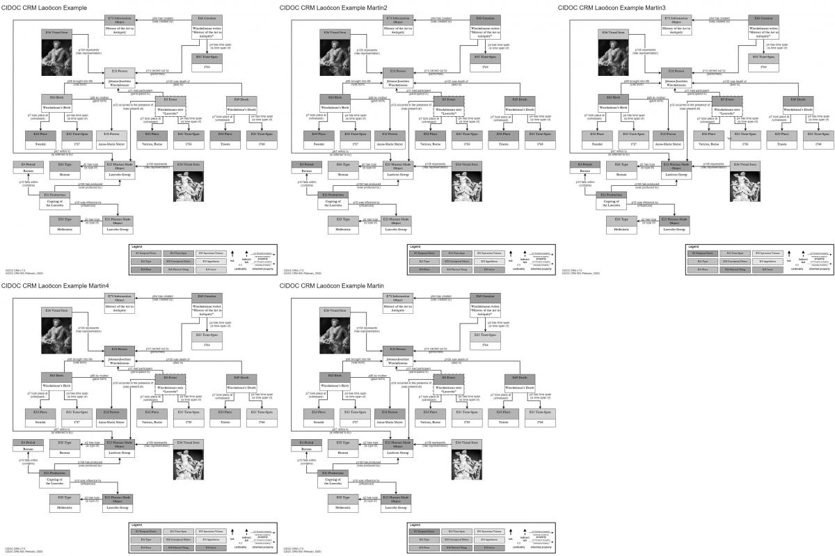
I am attaching two mosaics with the drawings as a group in colour and in grayscale. Some comments:
1) The subtle differences in colour between "martin", "martin3" and "martin4" are indistinguishable in practical terms (i.e. without colour profiling in place). So I do not think we can compare on different monitors (and probably different operating systems).
2) These colours do not work in grayscale so they cannot be used in print (I already had this problem when included a diagram in a book chapter and the editor had assumed it would be in black and white). But I think we considered that case out of scope.
3) Apart from personal preference, I cannot see any objective criteria on choosing Martin's colour scheme over the original proposal. Have I missed any communication?
4) I think the inverse property label in brackets is helpful (I do not think we will ever draw the arrow the inverse direction which might create confusion), I agree with bold font, but the inverse label in bracket as normal font weight.
5) It would be useful to be consistent on how we draw the property arrows. They should be connecting either the upper boxes of the classes or the lower boxes of the example instances. Probably the class boxes only, although this might create some confusion with the .1 properties?
6) Class boxes for Period and Production at the bottom left are smaller than other class boxes.
7) The dashed line of the Event is not included in the legend.
8) Dashed lines for inherited properties have not been used. Perhaps we do not need to indicate inherited properties and we could ignore dashed lines altogether.
Posted by Martin on 6/4/2020
Dear Thanasi,
I work on a Dell XPS 15 9560, claiming calibrated Adobe RGB color space, one of the better screens (4K) on the market. I attach a test image, that should appear smooth.
Posted by Thanasis Velios on 7/4/2020
Dear Martin,
I work on a Dell XPS 15 9560, claiming calibrated Adobe RGB color space, one of the better screens (4K) on the market. I attach a test image, that should appear smooth.
I have no doubt about the quality of your setup - it is mine that I am worried, let alone my ability to distinguish colours which has been criticised repeatedly in the past by family members
1) The subtle differences in colour between "martin", "martin3" and "martin4" are indistinguishable in practical terms (i.e. without colour profiling in place). So I do not think we can compare on different monitors (and probably different operating systems).
Well, I tried to counter the argument of "bright distracting colors".
Yes, I think this is where we might struggle to establish when a colour becomes distracting.
3) Apart from personal preference, I cannot see any objective criteria on choosing Martin's colour scheme over the original proposal. Have I missed any communication?
Yes, my argument is not personal aesthetic preference, but what makes orientation in a complex graph more easy. Currently in George's proposal, E2 and E52 do not separate well, but should. E28 is very bright, and creates a distinct highlight. A good test would be to ask students, how quickly they can read the graph and tell the story.
I am sorry I can not share easily the experience we had in the past with large instance graphs in the SIS system. Only introducing well distinguished colors made reading easy. I am very much concerned about a graphical language that makes comprehension of event-centric graphs easy and immediate. Probably an experiment with researchSpace would be more relevant.
The problem between us is that we understand the graph already well:-D, and cannot easily take a novice's position.
Hm, students and ResearchSpace tests are difficult at the moment but I tested with my wife who is a visual artist interested in interior decoration and also has studied art history but has no familiarity with the CRM. She prefers example Martin2. Her comments were:
1) She thought that the high yellow in E73 is necessary and that the pale version made these items disappear.
2) In George's version, she also noted that E5 and E52 are too similar.
3) She preferred the deep pink for Events which then requires E21 to change as well.
4) I think the inverse property label in brackets is helpful (I do not think we will ever draw the arrow the inverse direction which might create confusion), I agree with bold font, but the inverse label in bracket as normal font weight.
I rather think it is confusing, because it increases the complexity of the graph presented. The idea is to use the label of the direction of the arrow, regardless which is chosen. The direction should be intuitive. Bold property labels help reading quickly the story
Regarding the direction, I think the learning curve for the CRM is so steep that intuition for this issue does not really make much difference. Presenting the property labels with brackets in some parts of the document and without in others may raise questions to newcomers. But it is true that the graph will be less cluttered without them.
5) It would be useful to be consistent on how we draw the property arrows. They should be connecting either the upper boxes of the classes or the lower boxes of the example instances. Probably the class boxes only, although this might create some confusion with the .1 properties?
I have used the lower instance boxes by preference, because the arrows are property instances and not possible property kinds, as in schema graphs. The problem is that in either way, we loose one face for connecting arrows.
Draw.io allows multiple origin points from each face so I think we can manage if we think making this distinction is important.
Posted by Martin on 7/4/2020
Dear All,
Attached my CRM hierarchy in two color versions (slide 1, slide 2). After several hours of optimizing the layout, I get a complete picture of the CRM class hierarchy on one screen.
I'll send later one with George's colors.
In the 47th joint meeting of the CIDOC CRM SIG and ISO/TC46/SC4/WG9; 40th FRBR - CIDOC CRM Harmonization meeting; according to the disccussion followed the sig came up with a two part final proposal
Final proposal –part (i): Develop a geometric style-guide (no color) with use cases and user community clearly defined.
Result: 11 SIG members present in favor –none against.
Decision: Accept
Final proposal –part (ii): Try different color schemes on the style guide –once the geometric style guide has been determined.
Result: 11 SIG members present in favor –none against
Decision: Accept.
HW to determine the geometric style guide for representing the CRM diagrams: ML, MD, GB, CEO
June 2020
In the 57th CIDOC CRM & 50th FRBR/LRMoo SIG Meeting, the SIG reviewed the issue.
The issue has trivially been resolved by means of adopting the style guide by CHIN in order to:
- redo the diagrams in the Functional Overview for the ISO version (5.0.4 and 7.1.3) and Official Community versions (7.1.2 at the moment)
- standardize the derivation of rdf triples from draw.io diagrams (see presentation by ETz).
To the SIGs mind, however, the style guide used in the representations of modeling constructs under Functional Overview (HW by GB for 628) and in FORTH’s implementation (presentation by ETz) are not identical to CHIN’s library. Furthermore, AG mentioned that she intends to update the library for instances.
The SIG decided to not close the issue, despite the points it raises having been rendered moot:
- the color-code used is that of CHIN (also features in projects like SARI, the CRMgame –card & digital version), and
- the use of a double line arrow to designate IsA relations has been abandoned, since the diagrams are not done in ppt anymore.
The issue has now drifted to making sure that the CHIN library gets enhanced with class/property instance representations and that the color code used in FORTHs implementation is in fact identical to that of CHIN.
The diagrams in the CRMbase will eventually have to be redone.
Group to settle this once and for all: PM, AG, GB, MD, ETz.
Marseille, October 2023
Post by Philippe Michon (11 March 2024)
Dear all,
Before the meeting to be held next week, I am sharing with you a first version of the CIDOC CRM Diagramming Guidelines. During the meeting, we will have the chance to review the broad outlines of this document, but also to concretely experiment with what an implementation of these guidelines could look like in a tool like diagrams.net/draw.io.
Looking forward to seeing you next week,
Philippe
In the 58th joint meeting of the CIDOC CRM SIG and ISO/TC46/SC4/WG9, the SIG went through the proposal for standardizing the diagrams for CIDOC CRM and compatible extensions.
PM presented the guidelines for creating standardized diagrams for the CIDOC CRM & extensions. The document can be found here. The point of discussing the guidelines proposed therein, is to establish that everyone agrees to the color coding, the size of the fonts and the items listed.
The libraries that CHIN has implemented can be downloaded here (+property quantifiers, -property quantifiers).
- Nb: classes for primitive values are not defined in the libraries, seeing as they’re not defined in the rdfs file that is taken as the basis for creating these diagrams.
- The libraries can be extended to CRM compatible models.
The idea is to reuse existing implementations whenever possible, so the SIG was presented with:
- the three schemes in draw.io that have been proposed so far (by PM for CHIN, GB for SARI and other projects, and OM for the online version of the CRM game). They can be found here.
- the printed version of the 3 schemes. The printed version of the schemes can be found here.
- • the original color scheme used in the cardboard CRM game, which can be found here
PM asked for the SIG’s feedback concerning:
- adding prefixes in the diagrams,
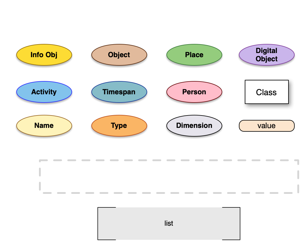
- create collapsible list objects for instances or not (his take is that such an approach would not allow representing multiple instantiation)
Discussion points:
- Regarding prefixes: not necessary, can be implemented locally in different systems.
- The diagrams in the Use and Learn section will have to be updated for version 7.1.3 (Official, ISO Compatible). If the issue gets resolved in the near future, the diagrams could be remade sooner than later.
- For instances, the list view is easier (just by clicking off the “collapsible” feature). It’s much easier to create rdfs structures from examples. This could be done by a reduplication of the library that the SIG will have decided upon.
Decision:
HW: StH, PM, and KN to come up with a final proposal taking into considerations the discussion at the SIG. It will probably be along the lines of:
- GB: E2, E52, E92
- PM: E28, E39, E41, E53, E55
- OM: E18
Once the SIG has agreed on the color scheme, the same group will continue working on extensions.
The group has to decide by the end of the spring, to allow for redoing the diagrams at the Use&Learn section.
Paris, March 2024
In the 60th joint meeting of the CIDOC CRM and ISO/TC46/SC4/WG9 & 53rd FRBR/LRMoo SIG, the group reviewed the issue and decided to keep it open until ETz & PM tell us it’s OK to shut it down –FORTH & CHIN are working to propose a standardized format for representing instances of classes.
HW: ETz & PM
Bern, April 2025